Three frontend stacks, no shared code and no authority to choose one.
3M’s software portfolio grew through acquisitions over several decades. The codebases stayed separate, and third-party vendor teams maintained them under different tooling and contract scopes.
24 collaborators across 11 departments in SIBG, Corporate IT and Scott Fire & Safety were audited. Production applications ran on three main frontend frameworks: Angular (Material v16), React (Material UI v7 and Base UI) and .NET.
No centralized code existed, so engineers approximated Figma designs by restyling third-party UI kits such as Bootstrap, Kendo and Material. That produced visual differences between the design file and the shipped screen, accessibility defects that each team fixed on its own, and long design reviews to catch both.
The design team was small and had no corporate authority to require a tool from contract teams. A single proprietary component library could not succeed under those conditions.
Teams adopted tokens that no one was required to use.
At least 6 teams across the organization used the packages, in 12+ products they were maintaining. Design values now reach code from Figma automatically, instead of being copied by hand. Features could also be built at higher fidelity and tested for edge cases before refinement sessions, so gaps were found earlier and at lower effort.
| Area | Before | After |
|---|---|---|
| Design values in code | Copied by hand from Figma frames and approximated with restyled UI kits. | Published to npm as CSS, SCSS, TypeScript, C# and XAML on every push. |
| Shared code across stacks | None across Angular, React and .NET. | One token set consumed by 6+ teams. |
| Design to validated flow | 3 weeks. | 1 afternoon. |
| Icon delivery | 1 to 2 days, through direct messages. | Under 60 seconds, from the npm package and catalog. |
The first plan: one Corporate foundation that every brand inherits.
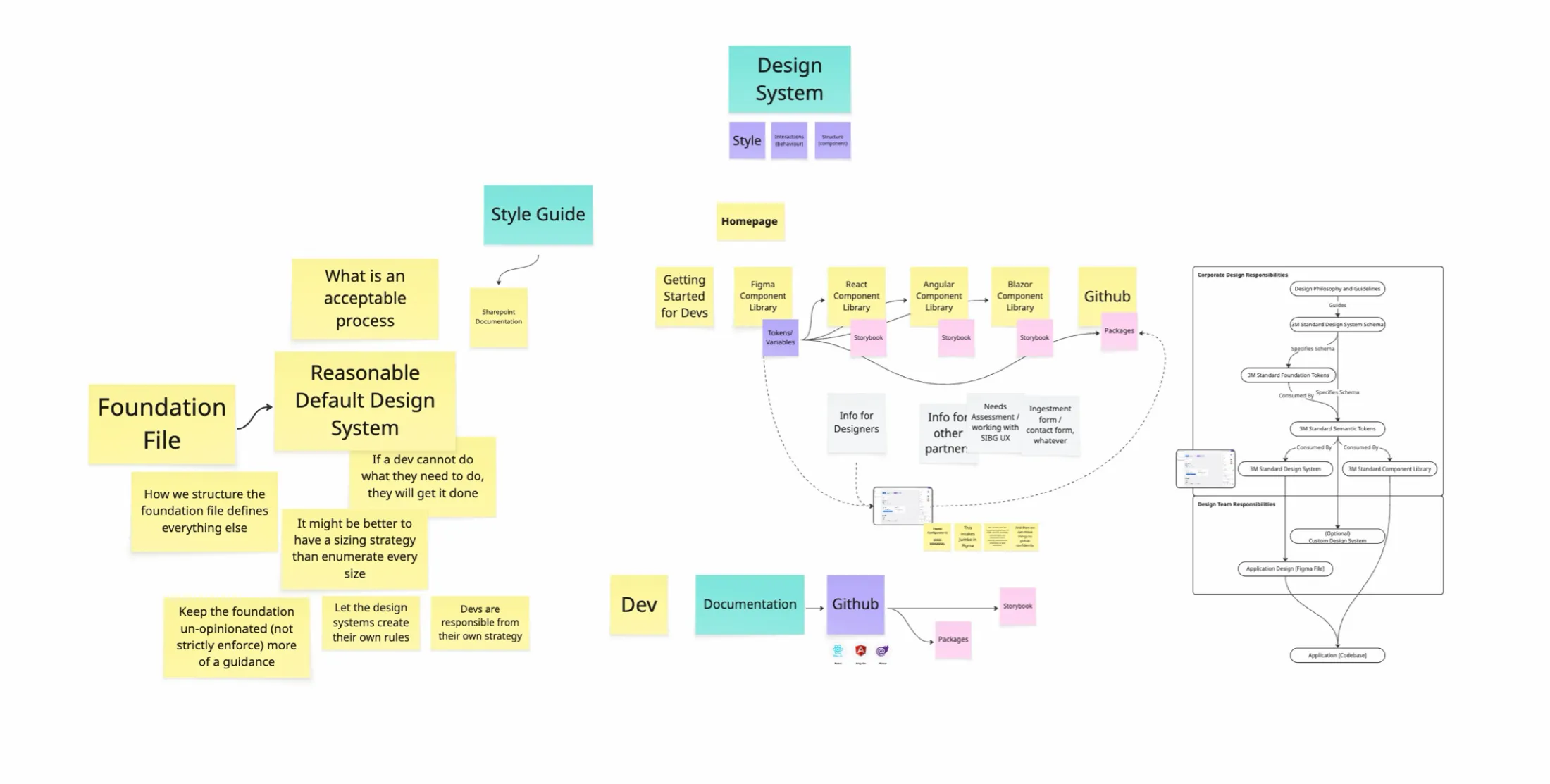
These are working artifacts from before any code existed. Each one settles a single question.
Where the files live
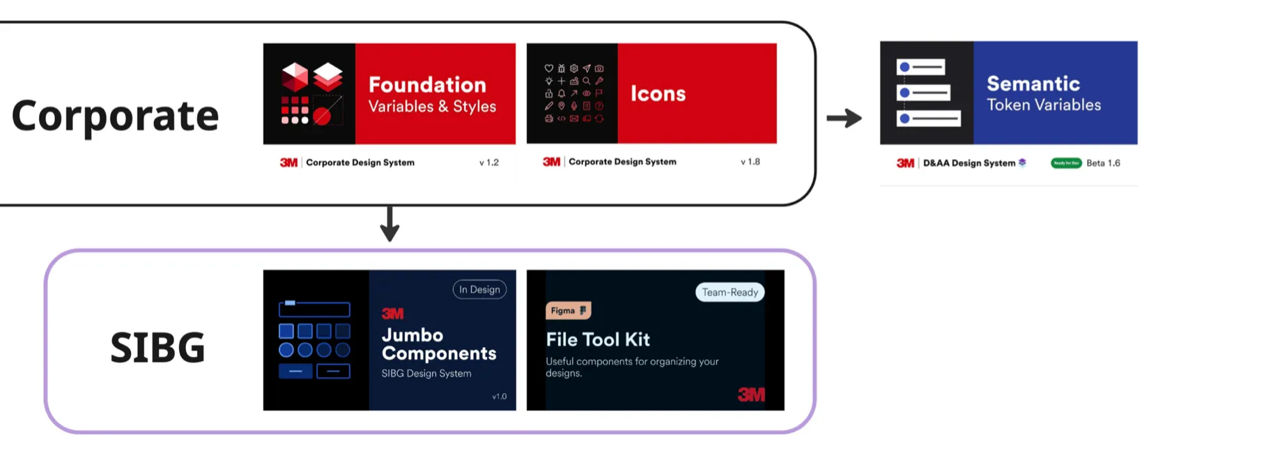
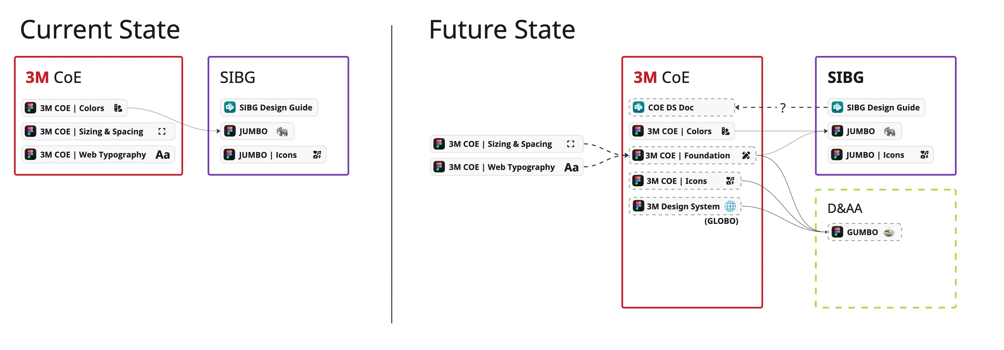
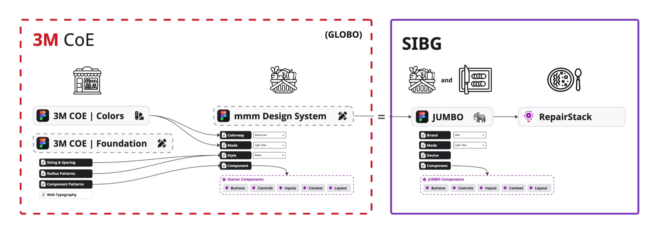
Corporate kept colors, sizing and spacing, and web typography in three separate Figma files. SIBG kept a SharePoint design guide, a JUMBO component file and a JUMBO icon file. The first strategy diagram merges the three Corporate files into one Foundation file that SIBG’s component library inherits from.
How tokens layer
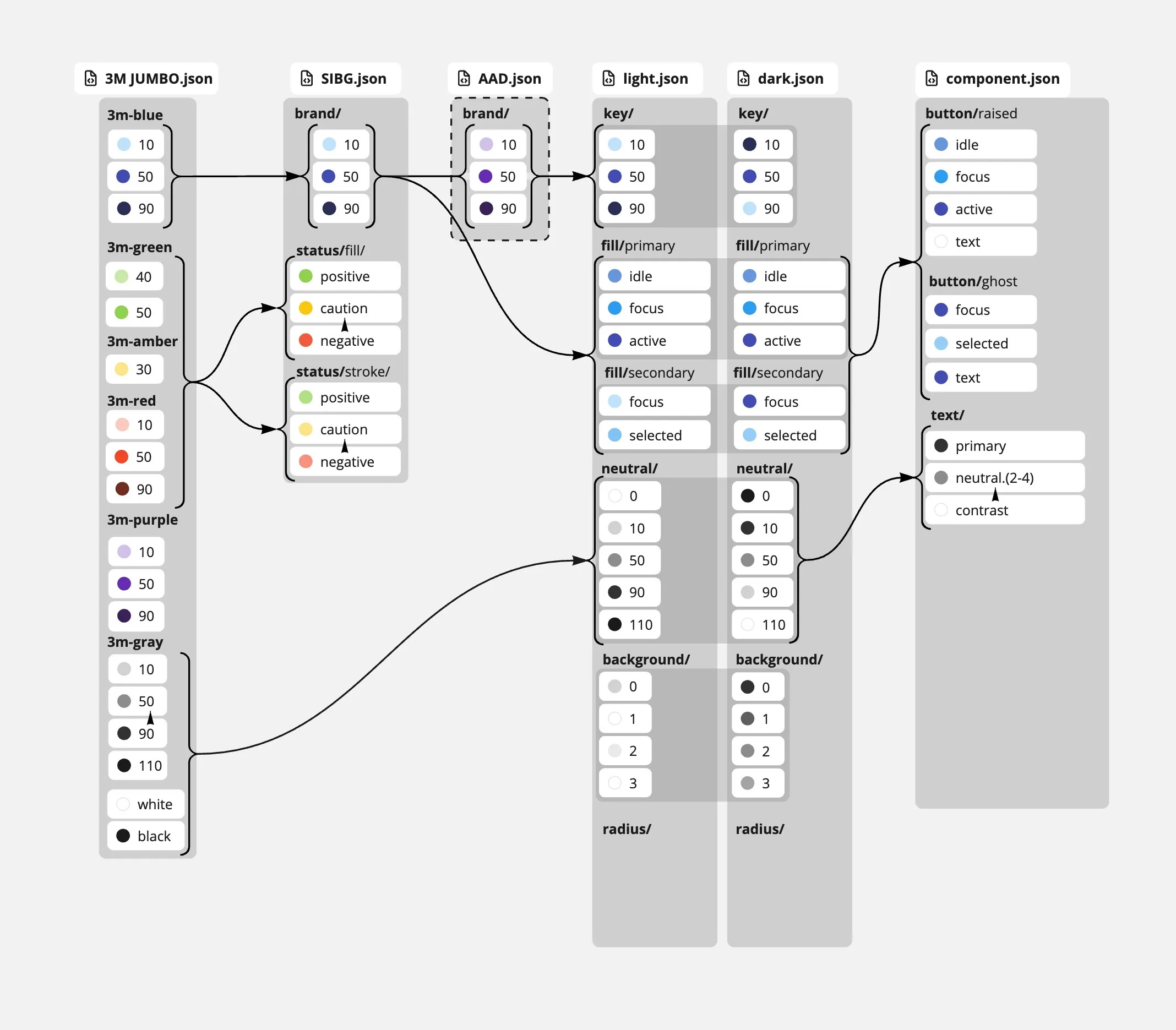
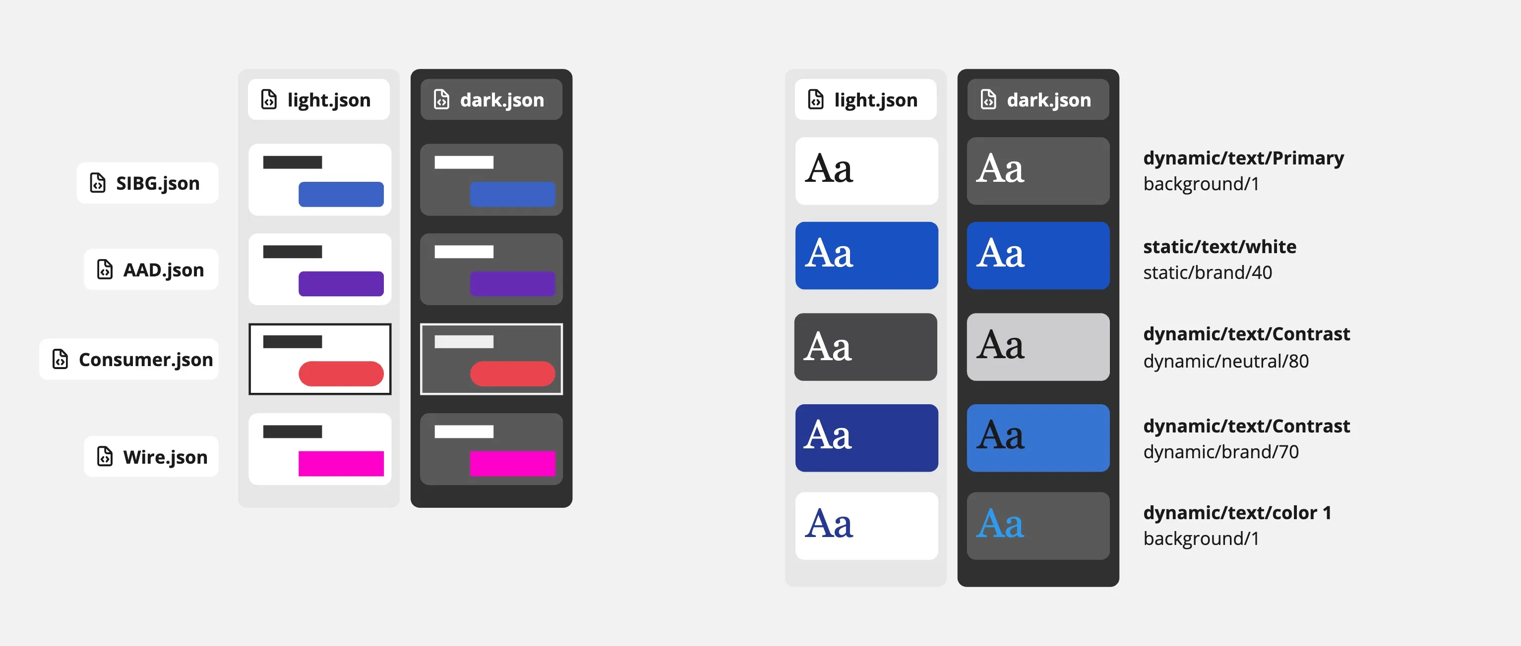
The first token model was a chain of JSON files. A 3M palette fed one file per brand, which fed light and dark files, which fed a component file.
How dark mode behaves
The chain did not say which values change between light and dark and which stay fixed. The next diagram pairs each text token with the surface it sits on. Dynamic tokens change with the mode. Static tokens, such as white text on a brand-40 fill, do not. The shipped tokens keep that split as a -fixed-dark suffix.
What sits above what
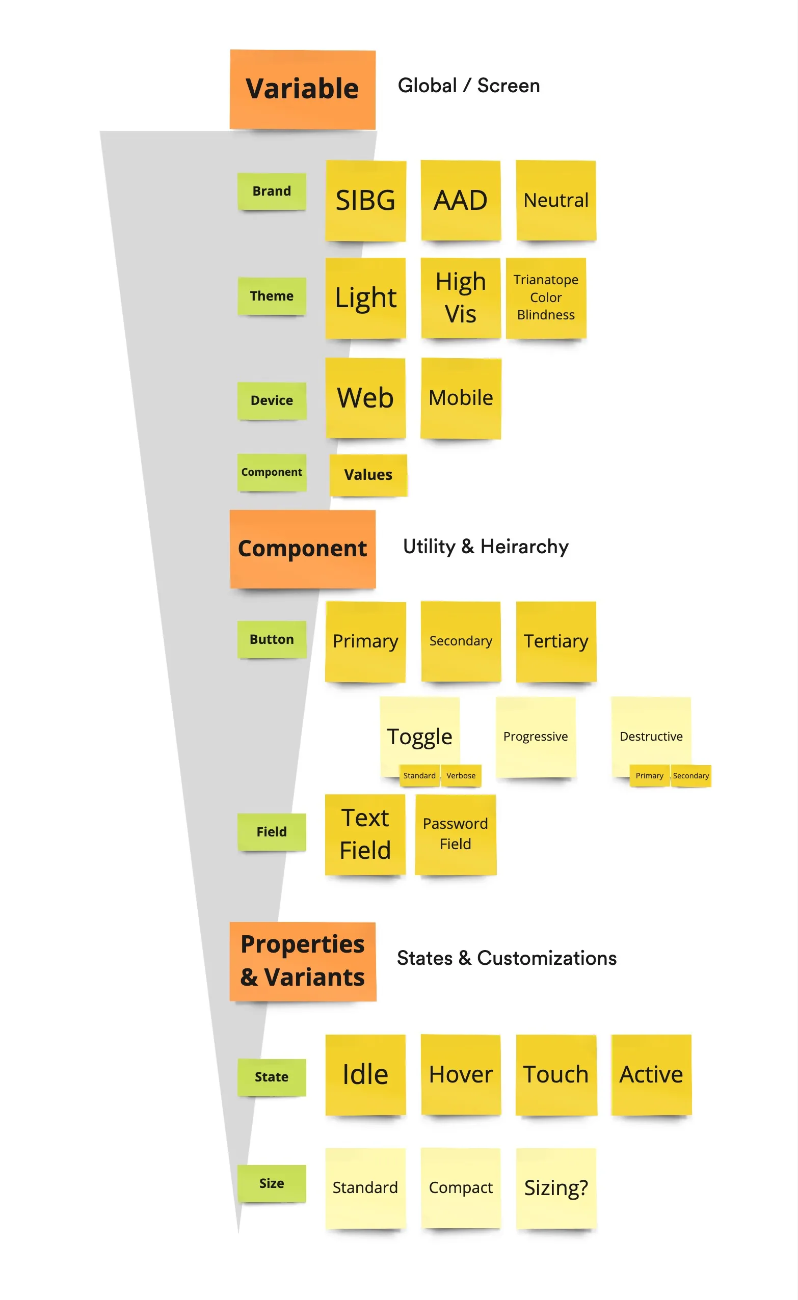
The value hierarchy puts brand, theme and device above components, and component states and sizes below. The open “Sizing?” note beside Standard and Compact became the device collection you will see later.
How it reaches engineers
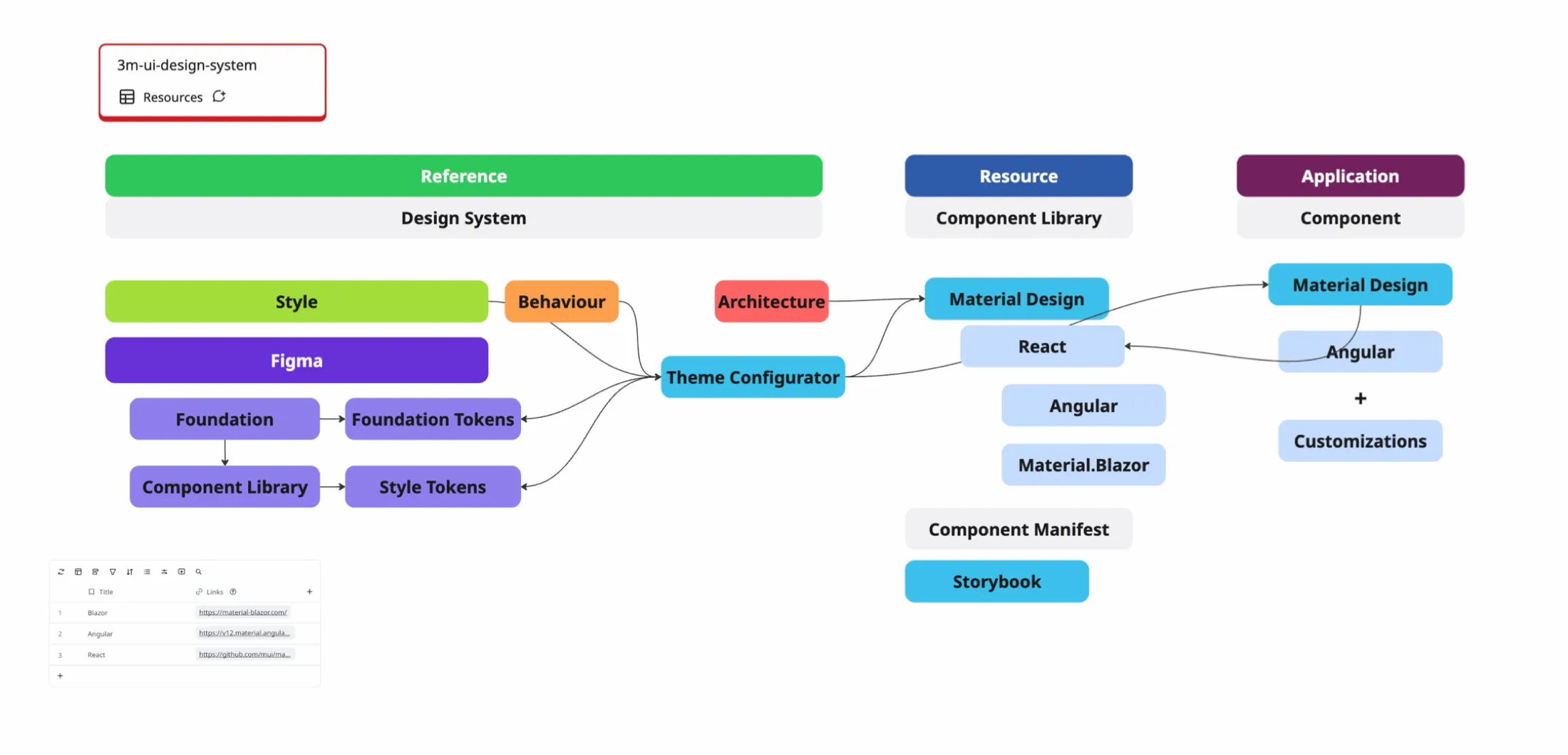
The architecture sketch uses a kitchen analogy. Corporate is the store, the 3M design system is the basket, SIBG adds a cutting board to prepare JUMBO, and an application such as RepairStack is the finished dish. The buildout map shows the same flow as software: Figma tokens feed a Theme Configurator, which configures the Material libraries that applications customize.
Five decisions that shaped the system.
Decision 1: Ship tokens and recipes, not a component library
Interviews with engineering leads changed the plan. Teams rejected pre-built components because custom state management, accessibility requirements and framework version differences made them hard to integrate. Engineers asked for component-level tokens and styling values they could apply to their own components. The design team also lacked the headcount to build, test and maintain separate libraries for React, Angular, .NET and HTML.
Decision 2: Split tokens into collections and switch them with modes
The shipped model has four Figma variable collections. Foundation, a separate library file, holds literal values. Brand points each brand at a hue ramp, a typeface and corner radii. Color Mode has 87 role-based variables with Light, Dark and High Contrast modes. Device has 93 sizing variables with Desktop, Tablet and Mobile modes. A switch in one collection changes only the values that depend on it.
Decision 3: Fail the build when Figma’s structure changes
Designers edit variables at any time, and the build finds modes by collection and mode name. A renamed mode would otherwise publish a package that silently lacks a device or a theme. The contract check (npm run contract:check) calls /v1/files/:key/variables/local and fails if the payload is missing collections or has zero variables. It also fails if the desktop or mobile device mode, or the light or dark color mode, is missing. A missing brand mode logs a warning. Fetch and build run only after the check passes.
Decision 4: Build on the Material libraries teams already used
The JUMBO monorepo (Nx with npm workspaces) turns Figma tokens into a framework-neutral core, then into three adapters: @3m-cloud/jumbo-mui returns an MUI v7 theme, @3m-cloud/jumbo-angular generates SCSS for Angular Material, and Jumbo.MaterialBlazor wraps Material.Blazor v5.
The design system constitution gives engineers three ways in and requires none of them: clone a model-home repository, copy a component or theme into an existing project, or build from the Theme Configurator’s HTML and CSS output and the Figma files. Design owns the Figma libraries and the configurator. Engineering sends pull requests to the model homes, so the system works like an internal open source project.
Decision 5: Contribute pull requests instead of handing off specifications
A new monorepo was joined that was rebuilding several acquired applications into one Angular codebase. Instead of specifications being written for the other engineers, custom HTML placeholder components were replaced with production components built on Angular Material, the token packages were installed to drive the Angular Material styling layer, and the tokenized components were used in live application features next to the core engineering team.
Built for agents: MANIFEST.md, llms.txt and an MCP server.
Engineers on these teams used AI coding assistants, and an assistant with no token source guesses values. In the Angular monorepo, a machine-readable component manifest (manifest.md) was added that lists token names, component parameters and layout rules. Developers wrote custom agent skills that point at it, so their assistants read token variables from the npm packages and produced brand-compliant layouts without styling errors.
The JUMBO repository extends the idea with generated files that no one edits by hand:
MANIFEST.mdandllms.txtas entry points.components.json, which covers 30 components with per-framework imports, props with allowed values, the tokens each one uses, do and don’t guidance and copy-paste recipes.tokens.json, with every resolved token set (6 brands, 2 themes and 3 devices).- A 9-section
DESIGN.mdcontract for each brand. - An MCP server that serves the same data, and three agent skills for consuming the system, auditing a design against it and keeping the manifest current.
An assistant that asks for the primary action color gets a structured answer that follows the same aliases traced in the token schema below.
{
  "token": "Background/Brand/Emphasis",
  "modes": { "light": "Brand/60", "dark": "Brand/60", "high-contrast": "Brand/70" },
  "resolved": {
    "SIBG": { "foundation": "mmm-color/blue/60",   "light": "#3373e0", "high-contrast": "#1751c2" },
    "AAD":  { "foundation": "mmm-color/purple/60", "light": "#9456d9", "high-contrast": "#7634bc" },
    "PSD: Scott": { "foundation": "mmm-color/red/60", "light": "#eb0029", "high-contrast": "#b7001c" }
  }
}
Two rules lead the consumption guide. Never hardcode a color, radius or size, and resolve each from a token. Match the brand’s look and feel, not only its values. The manifest is regenerated whenever the Figma tokens change, so the agent’s source of truth moves with the design.
What the system is for.
These are the statements that were returned to while each decision was made. They come from the constitution and from the prioritization notes.
Show the notes
Maximally configurable, minimally restrictive.
Constitution, section 1Accelerate product development and eliminate redundant work across the organization.
Constitution, section 1If a dev can’t do what they need to do, they’ll get it done anyway.
Prioritization notesKeep the foundation unopinionated. More guidance than enforcement.
Prioritization notesLet each design system create its own rules.
Prioritization notesA foundational toolset, not a rigid set of constraints.
Constitution, section 1Design owns the Figma libraries. Engineering can send pull requests to the model homes.
Constitution, section 5It might be better to have a sizing strategy than to list every size.
Prioritization notes
Every decision above follows from the second and third notes. If the system slows a team down, the team works around it, so the system has to be the fastest way to a correct screen.
Four tiers, and each one changes for a different reason.
Tap a tier to see what it holds and what makes its values change. Counts are the variable counts in the Foundations and JUMBO Components Figma files.
Semantic: Color Mode and Device
Names describe a role, such as Background/Brand/Emphasis or Button/height/standard. The value behind a role changes with the selected mode or device.
- Size
- 87 color roles × 3 modes, 93 sizing values × 3 devices
- Changes with
- Color mode (Light, Dark, High Contrast) and device (Desktop, Tablet, Mobile).
Background/Brand/EmphasisText/On-ColorBorder/Neutral/ControlButton/height/standard
Following one value from a color ramp to a component.
Each column is a tier. Each line is an alias in Figma. Pick a component, then change the brand, mode or device and watch which nodes change.
These chains are read from the Figma files. For example, in SIBG light mode a button’s fill is Background/Brand/Emphasis, which aliases Brand/60, which aliases mmm-color/blue/60. Switch the brand to AAD and the same button resolves through mmm-color/purple/60. Switch the device to tablet and its height moves from mmm-size/40 to mmm-size/64.
Foundation
Brand
Semantic
Component
UI
SIBG, light, desktop: Button · Fill resolves to #3373e0 through 3 tokens.
Sessions, builds and pull requests.
Audit and prioritization
The audit sheet listed each collaborator’s department, familiarity with the system, codebase and UI kit. Of the 24 collaborators across 11 departments, only six recorded a stack: three on Angular (Material), two on React (Material UI v7 or Base UI with Tailwind) and one on .NET.
The prioritization brainstorm produced the notes you saw as post-its, plus a sketch of the documentation site and of who is responsible for what.
The token pipeline
- The contract check confirms the collections and modes still exist.
- A fetch script reads the variables, resolves aliases and writes one token file per brand, device and color mode.
- Style Dictionary compiles each file into CSS custom properties, SCSS variables, JSON with TypeScript declarations, C# constants and WPF XAML dictionaries.
- GitHub Actions publishes
@3m-cloud/3m-foundation-tokensand@3m-cloud/sibg-jumbo-tokensto the company’s GitHub Packages registry on every push tomain, daily at 06:00 UTC and on demand.
Developers get IDE autocomplete and compile-time checks on token names. They no longer open Figma to find a value or convert hex codes to rems by hand.
The components
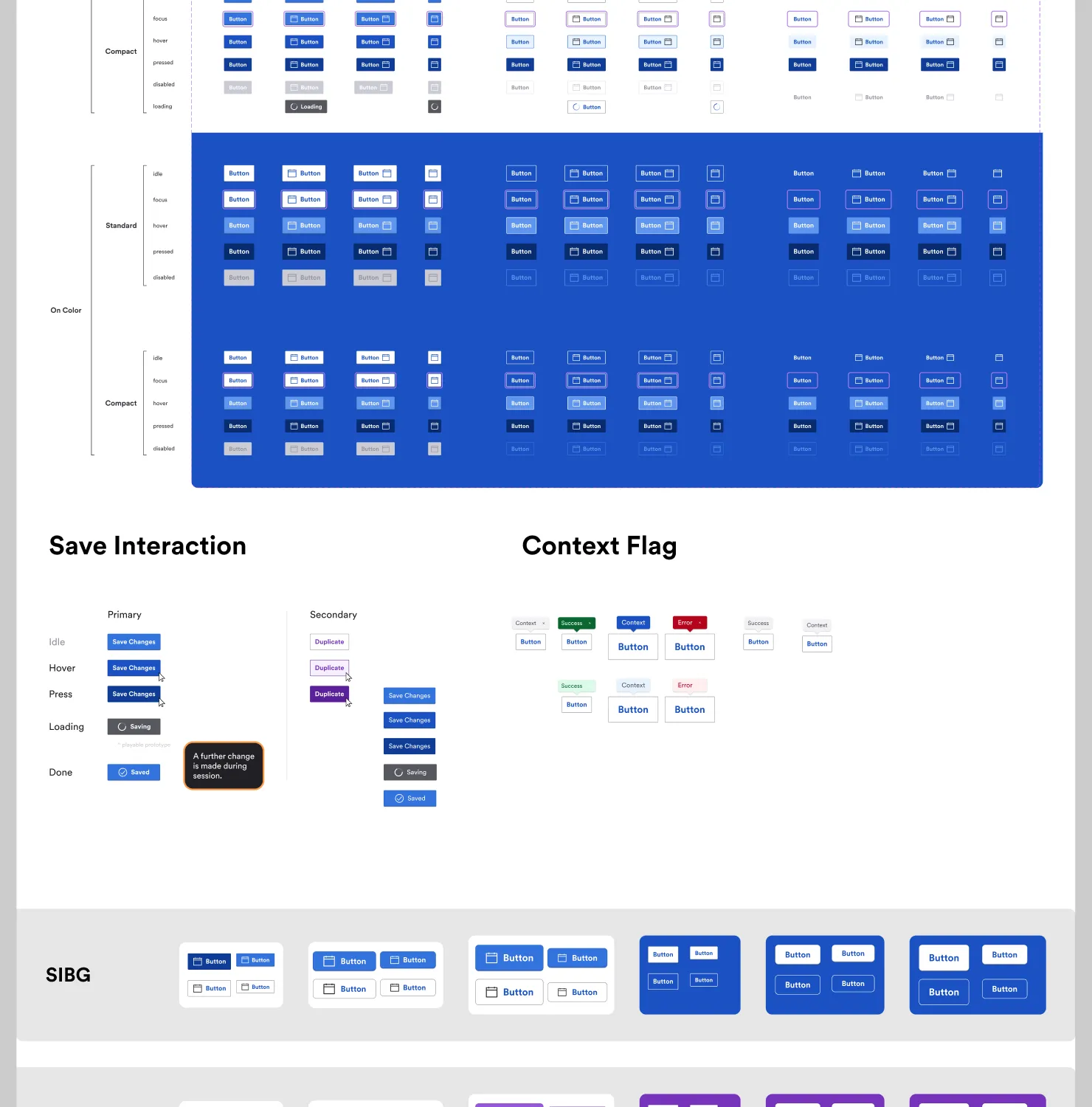
The component specs on this page are read from the Figma component library through its API. Each button, for instance, is defined for Standard and Compact sizes across idle, focus, hover, pressed, disabled and loading states, on neutral and on brand-colored backgrounds, with a row per brand.
The pull requests
The Angular monorepo changes were small and visible. The first block is an illustrative example of hand-matching a Figma frame to a stock Angular Material color. The second uses token names and values from the published SIBG package.
// Before: values copied from a Figma frame
.save-button {
  background: #3f51b5;
  color: #fff;
  height: 36px;
  border-radius: 4px;
}
// After: values from @3m-cloud/sibg-jumbo-tokens
@use "@3m-cloud/sibg-jumbo-tokens/dist/sibg/desktop/light/scss/variables" as t;
.save-button {
background: t.$bg-brand-emphasis; // #3373e0
color: t.$text-on-color; // #ffffff
height: t.$button-height-standard * 1px; // 40
border-radius: t.$button-radius * 1px; // 2
}Results
External development teams installed the packages without a mandate: at least 6 teams, in 12+ products. Code completion reduced their ticket delivery time. Rework was not eliminated, but iteration was accelerated: features could be built at higher fidelity and edge cases tested before a flow reached a refinement session, so usability and functionality gaps were found and addressed earlier in the design process, at lower effort. The Foundation holds 389 variables (297 colors, 55 dimensions, 25 shadow values and 12 opacities), and the adapters cover three frameworks: Angular Material, MUI and Material.Blazor. One design systems architect supported several framework environments without maintaining parallel component libraries.
Status at departure
| State | Work |
|---|---|
| Shipped | The Figma-to-npm token pipeline for Foundation and Semantic tokens, and the Angular Material integration in the production monorepo. |
| In progress | Component-level token architecture was being explored. The React and .NET translations existed as architectural guides, and the Blazor adapter wrapped six Material.Blazor components. |
| Ended | Active work stopped when 3M reorganized its engineering teams. |
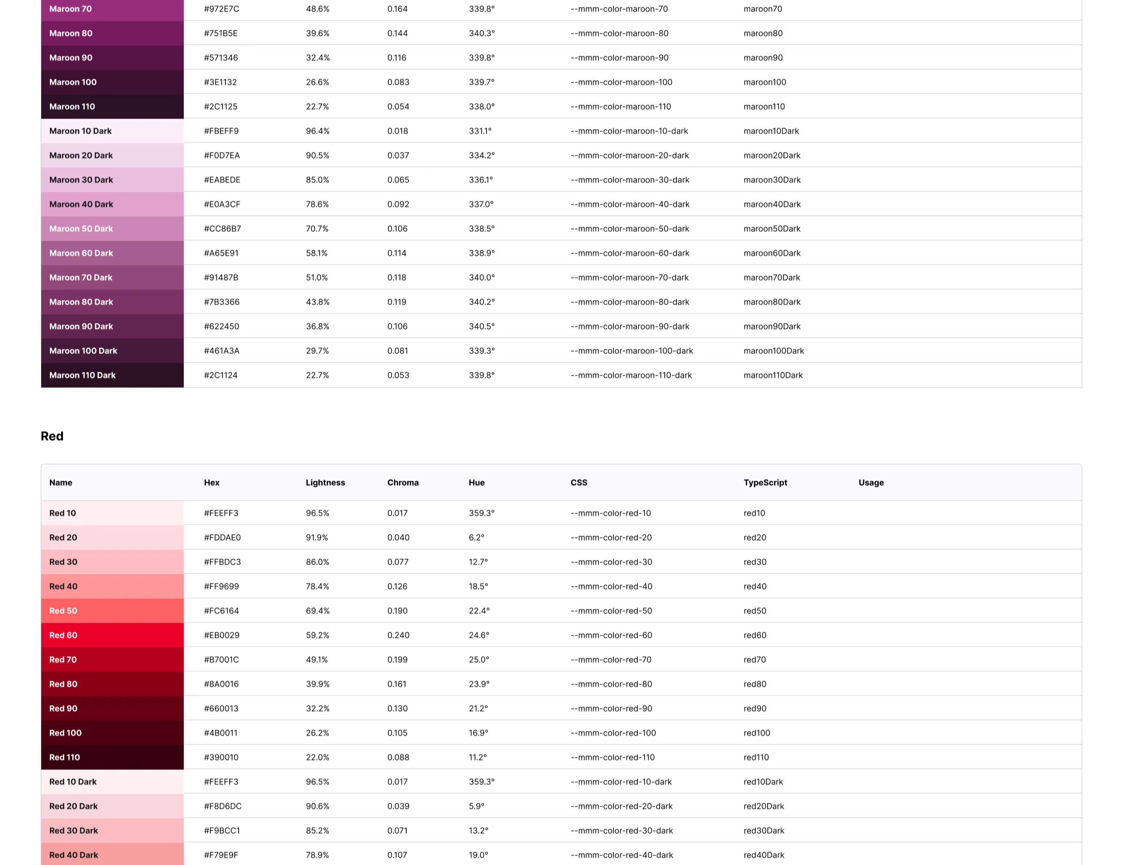
The full Foundation token set.
Everything below is read from the Foundations and JUMBO Components Figma files. Start with the color wall and tap a swatch to see where it goes.
Show the color wall and variable tables
mmm-color/blue/60#3373e0Brand/60 in SIBG, EMD. Brand/Accent/60 in Neutral. Feeds Background/Brand/Emphasis (Light, Dark) and 3 more semantic tokens. Reaches: button fill, tag fill, toggle rail.
Tap a swatch to see which brand and semantic tokens point at it.
One screen, six brands, three modes, three devices.
This screen is built from the Button, Tag, Toggle and Field specs in the component library. Nothing on it has a hard-coded color or size.
Change the brand, mode or device, or press Play tour. Tap any element to trace its token back to the Foundation value. On Tablet the standard button grows to 64 px. On Mobile it is 48 px. PSD: Scott rounds buttons to 4 px, Wireframe uses 0 and SIBG uses 2.
Quarterly inspection
Review the findings, then submit to the site manager.
Tap or click any part of the screen to trace its token. Every color, size and radius on it is read from the Figma variables.